The Continuing Story of Neutral
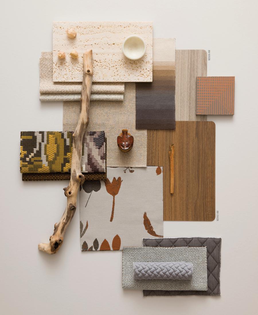
HPL has always been a trusted work-horse material due to its cleanability, durability and cost-effectiveness. Within the last decade, advances in printing and finish technologies have given HPL unprecedented decorative versatility.
The emerging color story of neutral responds to the desire for simplicity and visual confirmation of cleanliness. Technology makes us efficient and able to take on more tasks. But being always connected and always on can feel hectic. So we seek to declutter and reduce the noise within our spaces.
This concept manifests many ways in design. Examples include the enduring affinity for midcentury and Scandinavian design- styles that use natural wood tones, soft textures, and retro pops of color to create simple, tidy, harmonious spaces.
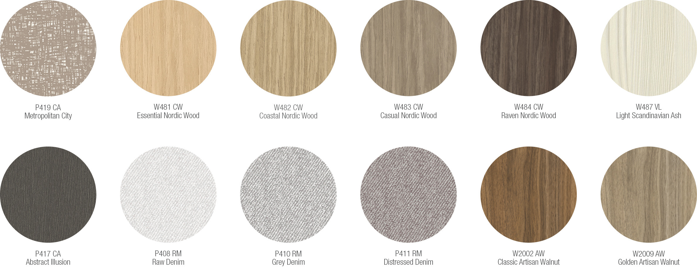
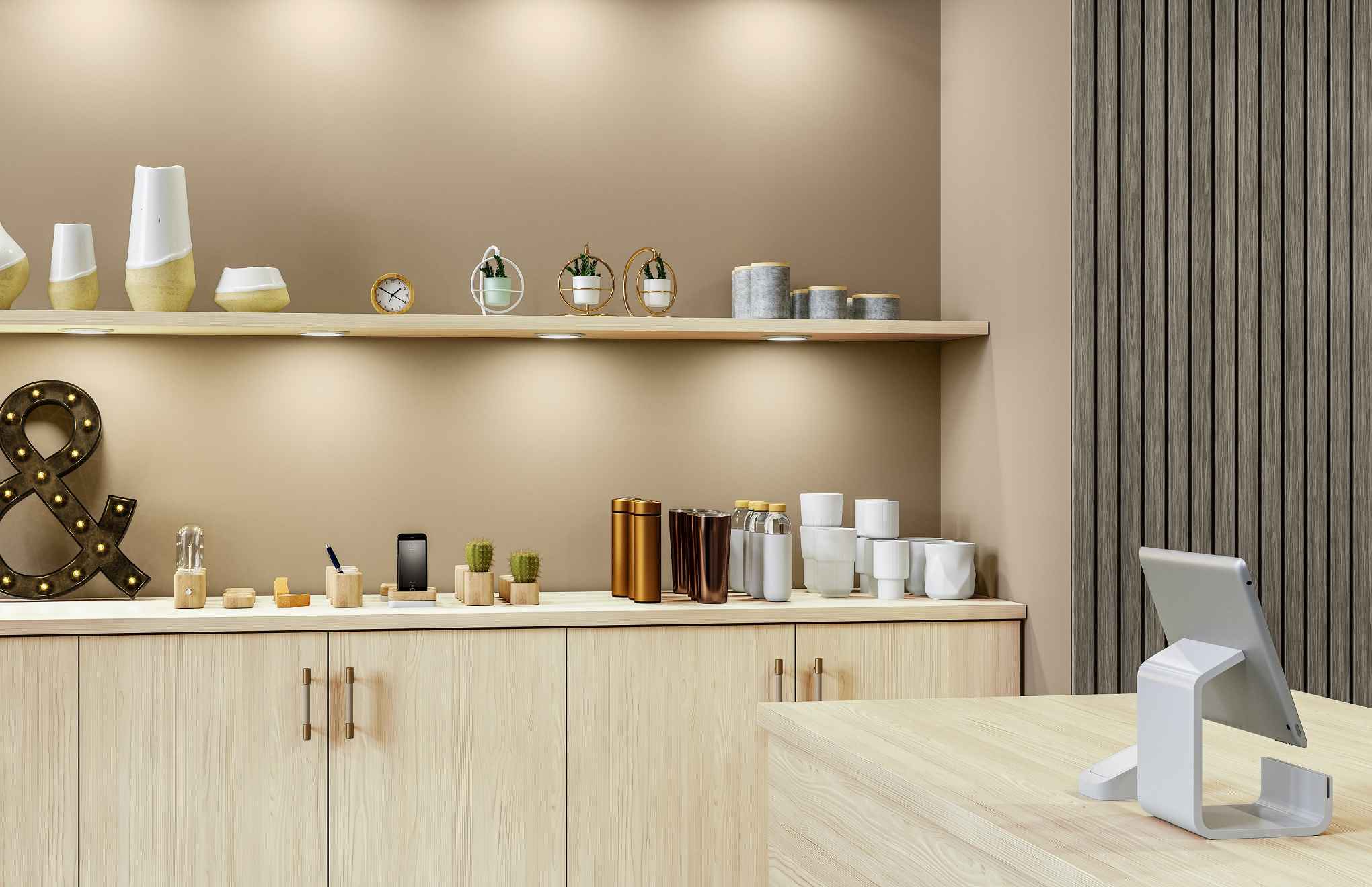 W487 VL Light Scandinavian Ash - W484 CW Raven Nordic Wood
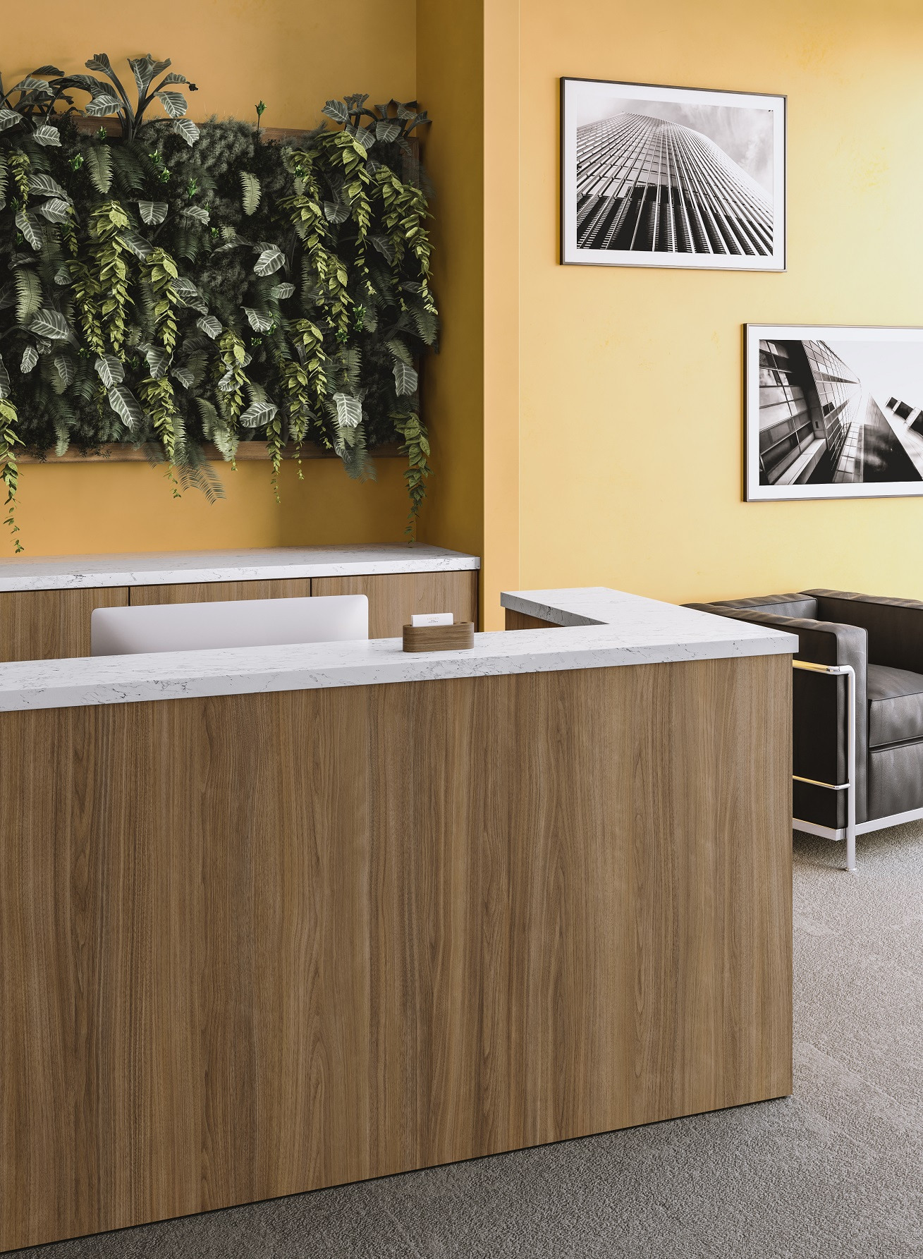 W2002 AW Classic Artisan Walnut - P1015 UL Carrara Venato
We also see neutrals being used to facilitate and balance the increasingly popular trend toward large-scale patterns. As flooring aesthetics become bigger and bolder, neutral accents are demurely supportive. Use of tone-on-tone neutral within an abstract design gives designers the ability to elegantly scale-up a design without visually shouting.
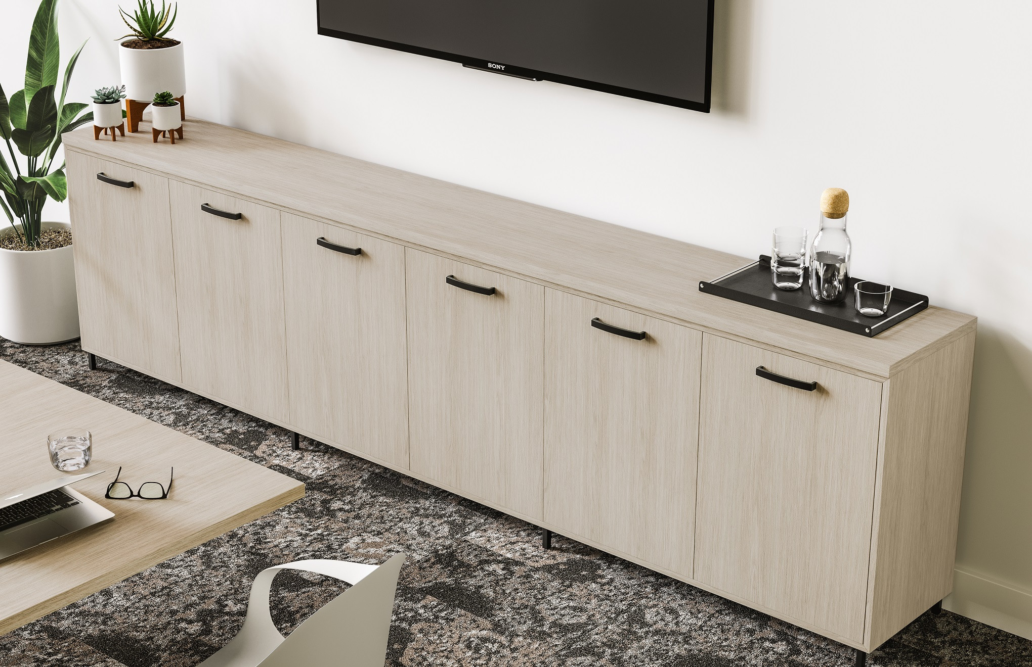 W481 CW Essential Nordic Wood
Natural, organic hues and soft-to-mid tones feel soothing and authentic. Grays from light to charcoal, warm spice colors such as saffron, turmeric and cinnamon, rich creams and pastels all contribute to a calm, clean look. Colors belonging to the contemporary neutral story are familiar and reassuring.
The following is a selection of patterns from our latest collection that compliment a range of neutral spaces. Order your free samples here.

Sign In
Create New Account